
Thursday, 1 May 2014
Tuesday, 29 April 2014

Thursday, 24 April 2014
Evaluation part 4: Skill Improvement
When I started my magazine at first I was terrible, I couldn't use any of the programmes properly my photos didn't appeal to my target audience and I wasn't able to use any of the tools to edit my photos. But after practicing and learning how to change my photos to how I wanted them I got the hang of it. I also learnt what makes a good front cover picture and how the background and the clothing of the model are extremely important to make your front cover photo look as good as possible. Another skill I learnt is how to edit the photos to get the look that I want for that photo. I also learnt how to edit the format of my text in my double page spread to make it look like a real music magazine.
Evaluation part 3: Audience
The audience my magazine targeted was teenagers that liked rebeliuos rock music. The reason I chose this audience is because it is the music I like myself and I feel that this audience is rejected by music magazines and that there aren't enought magazines that have explores this audience so this will give my magazine a real advantage because not many magazines do target this audience. My magazine attracts this audience threw a number of different ways the first one is the name of my magazine which is Revolution which basically means to rebel, brake the rules, fight the system etc. I have also made it appealing to this audience by including a cover model that looks like a stereotypical rebel with what is known as stereotypical rebel clothing of lether jacket, hood up which I think will appeal to my target audience. Another reason my magazine will stand out to my target audience is because the font that the name of my magaine is in, because its big, its bold and it makes a statement which being a rebel is all about making a statement.
Tuesday, 22 April 2014
Evaluation part 2: Institutions and Technologies
Institutions
An institution that I think might distributeis the Internatuional Publishing Company because they sell music magazines that are very similar to mine in design and in the genre of music they talk about, the music magazines that they own are NME and Guitar and Bass. I also think that my product would be good if it was distributed by this company because it's market force is the largest magazine distributor in the UK which means that my magazine will be seen more and more by the public. But unlike their othe rmagazines my product offers a more rebelious rock that will focus on teens that like to be in to rebelious music and are about not listening to rules as I feel that this audience is rejected by alot of big magazine companies so I think my product really focuses on this audience and really relates to this audience that has bben rejected for so long.
Technologies
From this experience I have learnt how important the technologies are for their jobs and how big of an influence they have on your final product;
Camera
The camera is one of the most important technologies used when making a music magazine like I used a olympus digital camera to take my pictures so that I could get pictures of reasonably good quality. Also when taking your pictures there are alot of things you have to take in to consideration like; is the lighting right, what pose should my model be in, is the models clothing right, is the background right etc.
Computers
Computers are the most important piece of technology that you use when making a music magazine because all of your work is put together on the computer to actually make your magazine. You use the programmes on the computer to create your front cover, contents page etc. But also your computer is vital towards your internet research so that you have any idea what a real magazine looks like and how your magazine could be improved.
Photoshop
Photoshop is one of the most important technologies use dwhen making your magazine because this is the programme where you actually put your magazine together where you can add your photos and text to create your very own magazine. It also allows you to edit your photos so if the photo doesn't look quite right then you can edit it until you think it looks better for example you can desaturate the clour, stretch the photo, crop it down and do loads of other things to make the photo to your liking.
This means that photoshop is also the most difficult technology to use because it takes time to learn how to use the different tools to edit your photos but with a little help and time to get used to it you can edit the photos however you like.
Publisher
Publisher is quite an important technology because a lot of the text you do for your magazine like the double page spread because it allows you to edit the format of the text so that it can look like a real music magazines double page spread. However if you want to edit the photos then you have to use photoshop to do that.
Internet Research
Internet research is one of the most vital parts of your magazine because you firstly need to look at all the details of real music magazines and then incorporate them details in to your magazine like making the masthead the biggest text on your front cover, the correct front cover rmodel photo etc. The internet research is also really important to look at how the format of the magazine is set out and how could you improve your magazine by using ideas of magazines that you have found in your research.
Evaluation Part 1
My magazine is meant to represent rebelious rock artists/people and I've shown this by dressing my front cover model in stereotypical rebelious clothing so he is wearing a lether jacket which is seen as a common material warn by rebelious rock artists, also he has his hood up which is stereotypical that is rebelious and doesn't follow rules. Also the other bands that I have featured in my magazine are known as being quite rebeliuos in their music and the way they act.

I believe I have used most of the conventions needed for a real media product as I've made sure that the front cover model dominates most of the magazine. I have made my masthead the most dominant piece of text that is on the magazine so that people can recognise the title instantly. Also the second biggest text is the name of my front cover artist and the story title linked with them. I have also made sure to include the names of the other bands who are going to be mentioned in the magazine so that if anyone wants to read about any of the bands that are mentioned on the front cover customers will be urged to buy it.
I think that my magazine thoruoghly represents the charcteristics of a real music magazine and here are a few examples of real magazines that I used as inspiration for my magazine;
Tuesday, 15 April 2014
Final double spread page

Thursday, 3 April 2014

Tuesday, 1 April 2014


Thursday, 27 March 2014


This is my final front cover for my magazine, it was quite difficult to make as I have no previous experience working with photoshop but I am happy with how it turned out as I feel that my magazine does resemble a real music magaxine you might buy in a shop. For example I think that my front cover picture is very good because it makes my artist stand out and be noticed and my cover model fits the image of my magazine genre perfectly becasue I was going for a rebelious rock magazine and that is what my front cover model reprsesnts.
Tuesday, 25 March 2014

I also did a questionaie to see what font the name of my magazine should be, the reason I did this is because the font is what is going o make your magazine unique and well known because as soon as the public see the font they are going to remember the name of the magazine. These were the 4 candidates;
- REVOLUTION
-
REVOLUTION
- REVOLUTION
- REVOLUTION
The most popular font was REVOLUTION so this will be the font I will use for the front cover name of my magazine.
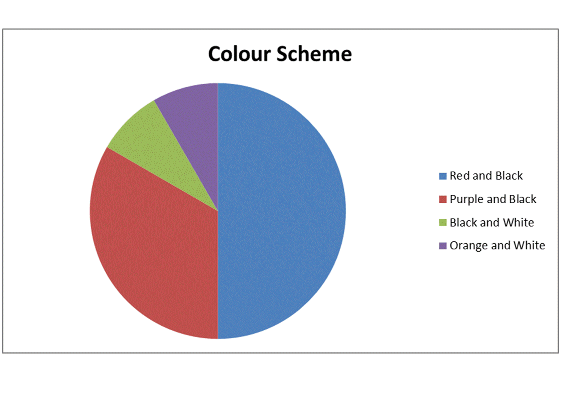
I also did a questionaire to let the public decide on what colour scheme they wanted for the magazine to see what colours they elated with a rock magazine and what colours would stand out to them.
The possible colour schemes;
The possible colour schemes;
- Red and Black
- Orange and White
- Purple and Black
- Black and White
My magazine was designed as a magazine that looked at rock bands/artists so I made a questionaire to ask my audience which kind of bands they wanted to feature in my magazine so that I could get an idea on what kind of bands the audience liked and which I could use in my magazine. I allowed the audience the chance to write down he names of their faviorite rock bands/artists and then I would count the amount of votes each band got and I used them on my magazine.
The final group of bands I will be using in my magazine;
The final group of bands I will be using in my magazine;
- Shinedown
- Linkin Park
- Rise Against
- Skillet
Thursday, 20 March 2014

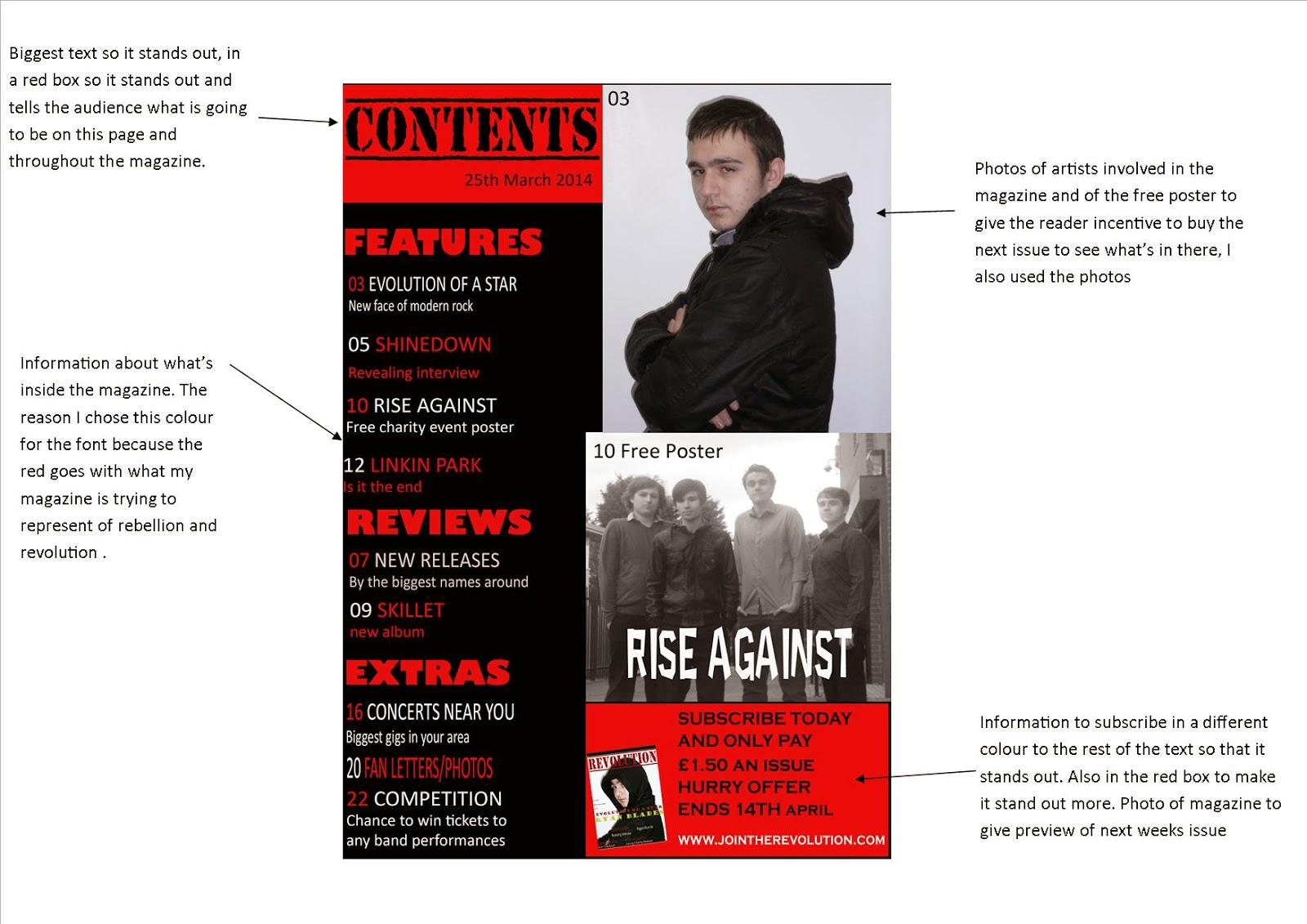
- It has contents in the biggest text along with the name of the magazine.
- It has a picture of an artist featured in the magazine.
- It tells the reader all of the features in the magazine along the side.
- It informs the reader on details for subscription.
- It also has a picture next to the subscription information of the front cover of the next issue.
- It has page numbers for the stories and who their about in case the reader wants to read about a certain artist in the magazine.
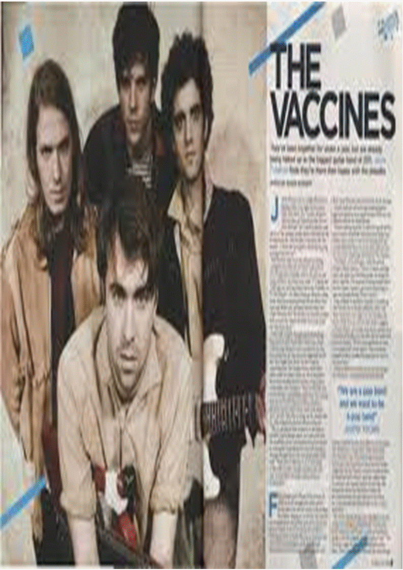
- The name of the artist is the biggest piece of text on the page (The Vaccines).
- There is a picture of the artist that the double page spread is talking about.
- The double page spread is arranged in to columns.
- First letter of the double page spread is bigger than the rest.
- Generally the artist that is on the front cover of the artist is also the artist that is talked about in the double page spread, so magazines need to pick a popular band for thier front cover so that people will want to buy and will then want to read more about them.

- The front cover models picture covers the entire front.
- The name of the front cover models is the 2nd biggets bit of text on the front cover.
- The name of the magazine is the biggets piece of text.
- Smaller pictures of bands that are also involved on the magazine.
- The first third of the magazine is very important as when the magazines are stacked on the shelves this is the part the customers see so it has to be recognisable to the customers.When you see that bold 'k' you know it's kerrang instantly this is why this is important.
- Titles of the features inside the magazine.
- The front cover artist has to be popular for their genre of music for people to be intersted in buying the magazine.


Tuesday, 18 March 2014


Subscribe to:
Comments (Atom)