 Questionaire page 2
Thursday, 27 March 2014


This is my final front cover for my magazine, it was quite difficult to make as I have no previous experience working with photoshop but I am happy with how it turned out as I feel that my magazine does resemble a real music magaxine you might buy in a shop. For example I think that my front cover picture is very good because it makes my artist stand out and be noticed and my cover model fits the image of my magazine genre perfectly becasue I was going for a rebelious rock magazine and that is what my front cover model reprsesnts.
Tuesday, 25 March 2014

I also did a questionaie to see what font the name of my magazine should be, the reason I did this is because the font is what is going o make your magazine unique and well known because as soon as the public see the font they are going to remember the name of the magazine. These were the 4 candidates;
- REVOLUTION
-
REVOLUTION
- REVOLUTION
- REVOLUTION
The most popular font was REVOLUTION so this will be the font I will use for the front cover name of my magazine.
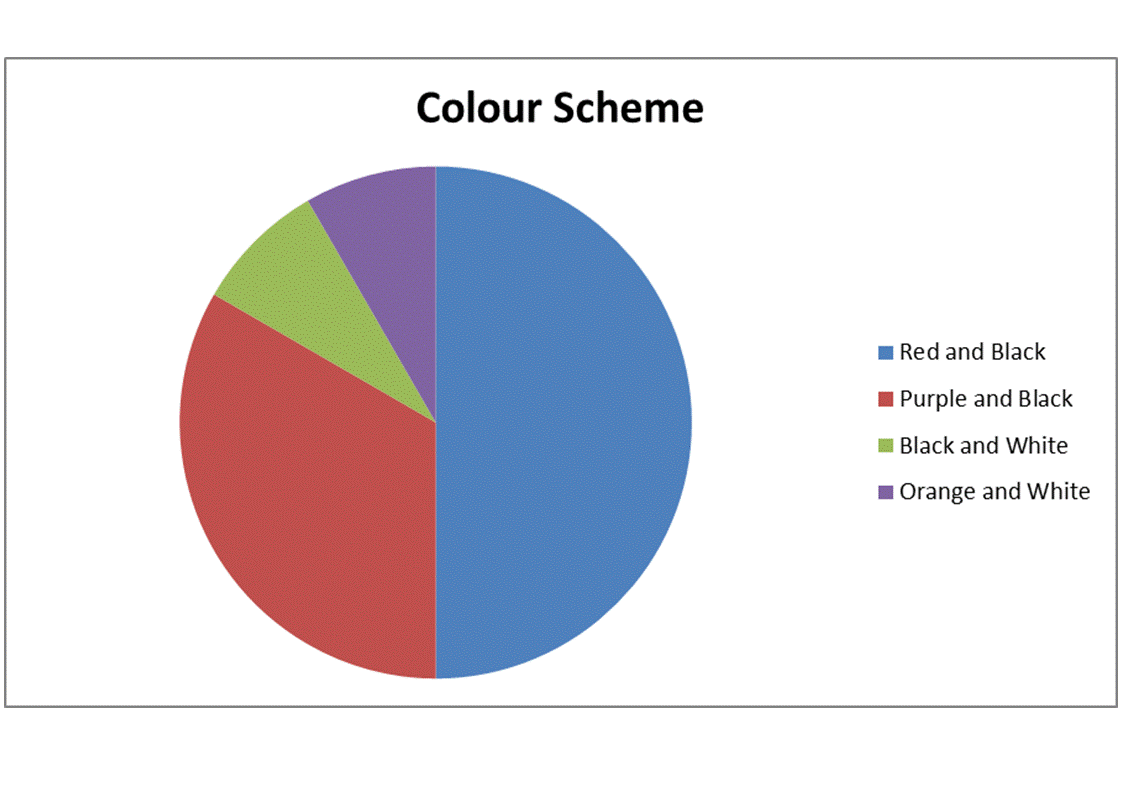
I also did a questionaire to let the public decide on what colour scheme they wanted for the magazine to see what colours they elated with a rock magazine and what colours would stand out to them.
The possible colour schemes;
The possible colour schemes;
- Red and Black
- Orange and White
- Purple and Black
- Black and White
My magazine was designed as a magazine that looked at rock bands/artists so I made a questionaire to ask my audience which kind of bands they wanted to feature in my magazine so that I could get an idea on what kind of bands the audience liked and which I could use in my magazine. I allowed the audience the chance to write down he names of their faviorite rock bands/artists and then I would count the amount of votes each band got and I used them on my magazine.
The final group of bands I will be using in my magazine;
The final group of bands I will be using in my magazine;
- Shinedown
- Linkin Park
- Rise Against
- Skillet
Thursday, 20 March 2014

- It has contents in the biggest text along with the name of the magazine.
- It has a picture of an artist featured in the magazine.
- It tells the reader all of the features in the magazine along the side.
- It informs the reader on details for subscription.
- It also has a picture next to the subscription information of the front cover of the next issue.
- It has page numbers for the stories and who their about in case the reader wants to read about a certain artist in the magazine.
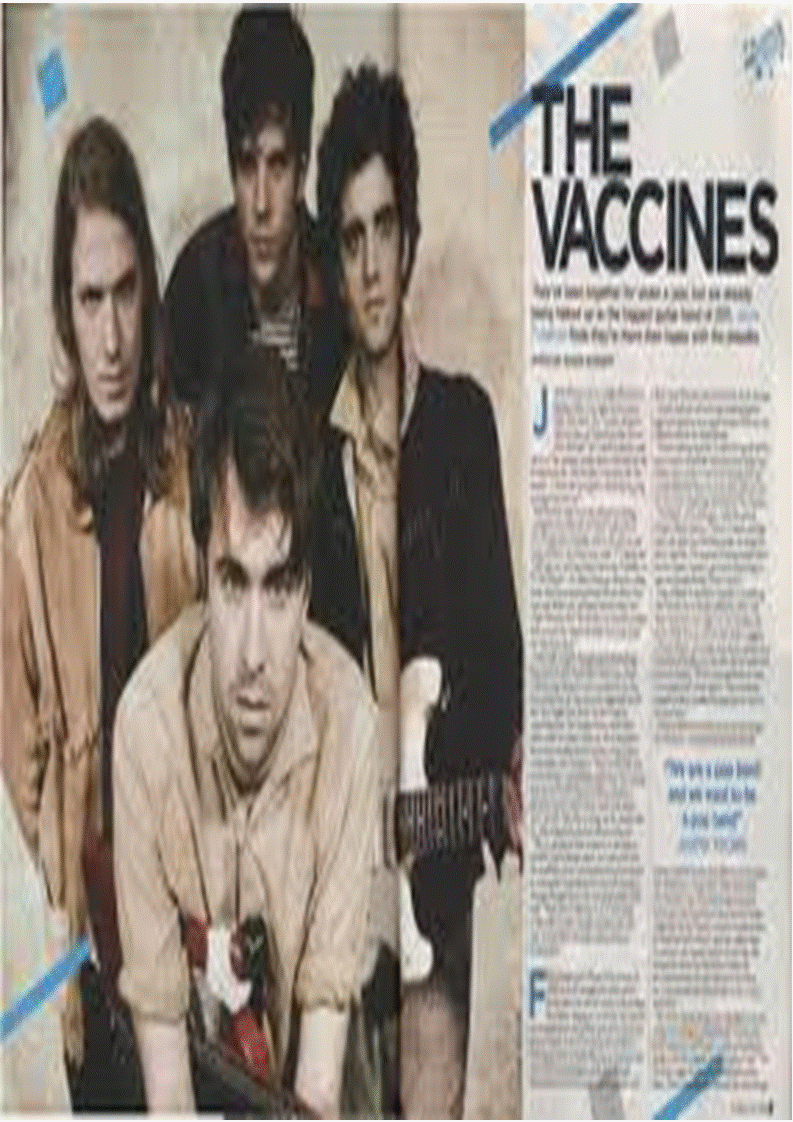
- The name of the artist is the biggest piece of text on the page (The Vaccines).
- There is a picture of the artist that the double page spread is talking about.
- The double page spread is arranged in to columns.
- First letter of the double page spread is bigger than the rest.
- Generally the artist that is on the front cover of the artist is also the artist that is talked about in the double page spread, so magazines need to pick a popular band for thier front cover so that people will want to buy and will then want to read more about them.

- The front cover models picture covers the entire front.
- The name of the front cover models is the 2nd biggets bit of text on the front cover.
- The name of the magazine is the biggets piece of text.
- Smaller pictures of bands that are also involved on the magazine.
- The first third of the magazine is very important as when the magazines are stacked on the shelves this is the part the customers see so it has to be recognisable to the customers.When you see that bold 'k' you know it's kerrang instantly this is why this is important.
- Titles of the features inside the magazine.
- The front cover artist has to be popular for their genre of music for people to be intersted in buying the magazine.


Tuesday, 18 March 2014


Subscribe to:
Comments (Atom)